

Banana is a plant-based retail shop focused on bananas. It means that every single product is related to this fruit.
The project required to put together a basic brand package with a series of three posters and social presence for the retail shop to promote their services to a young audience (18-35yrs).
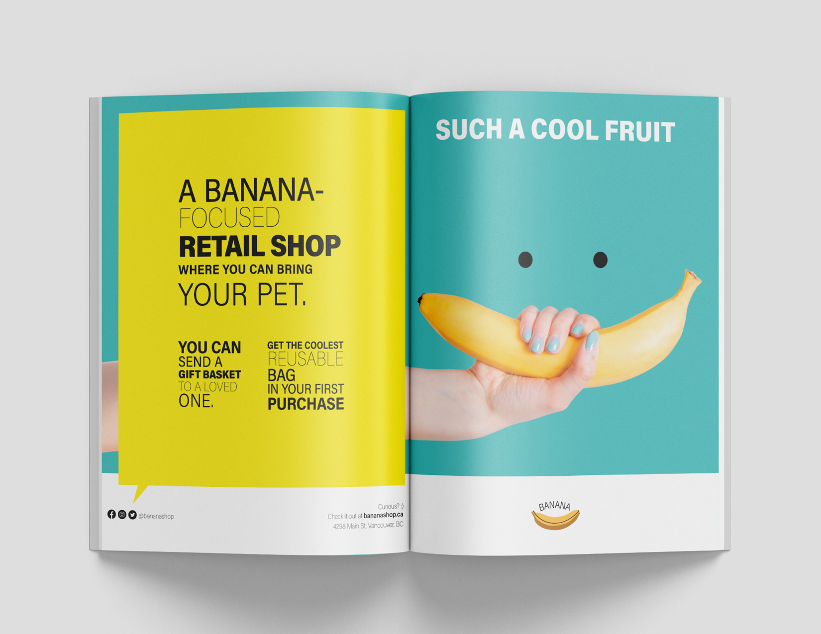
Split Page Ad - 17 x 11"
Arm & banana - my idea here was to use an arm in an awkward position in order to catch the attention.
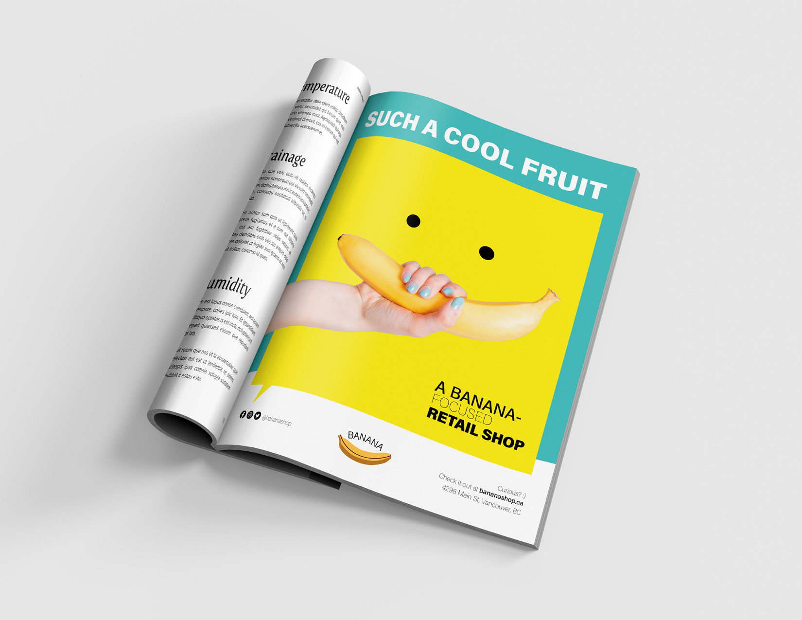
Magazine - 8.5 x 11"
Despite the colours are vibrant, the idea was to keep the design simple and clean as much as possible to stand out each element within the hierarchy.
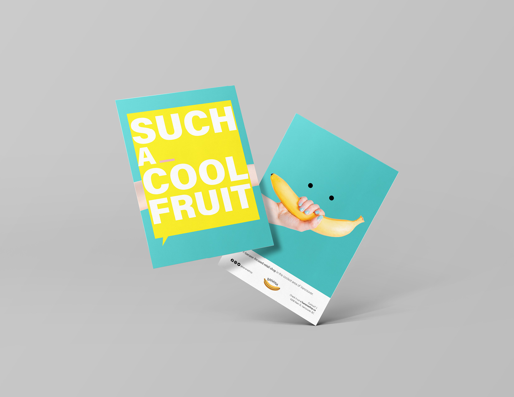
Handout - 4 x 6"
Social MEDIA
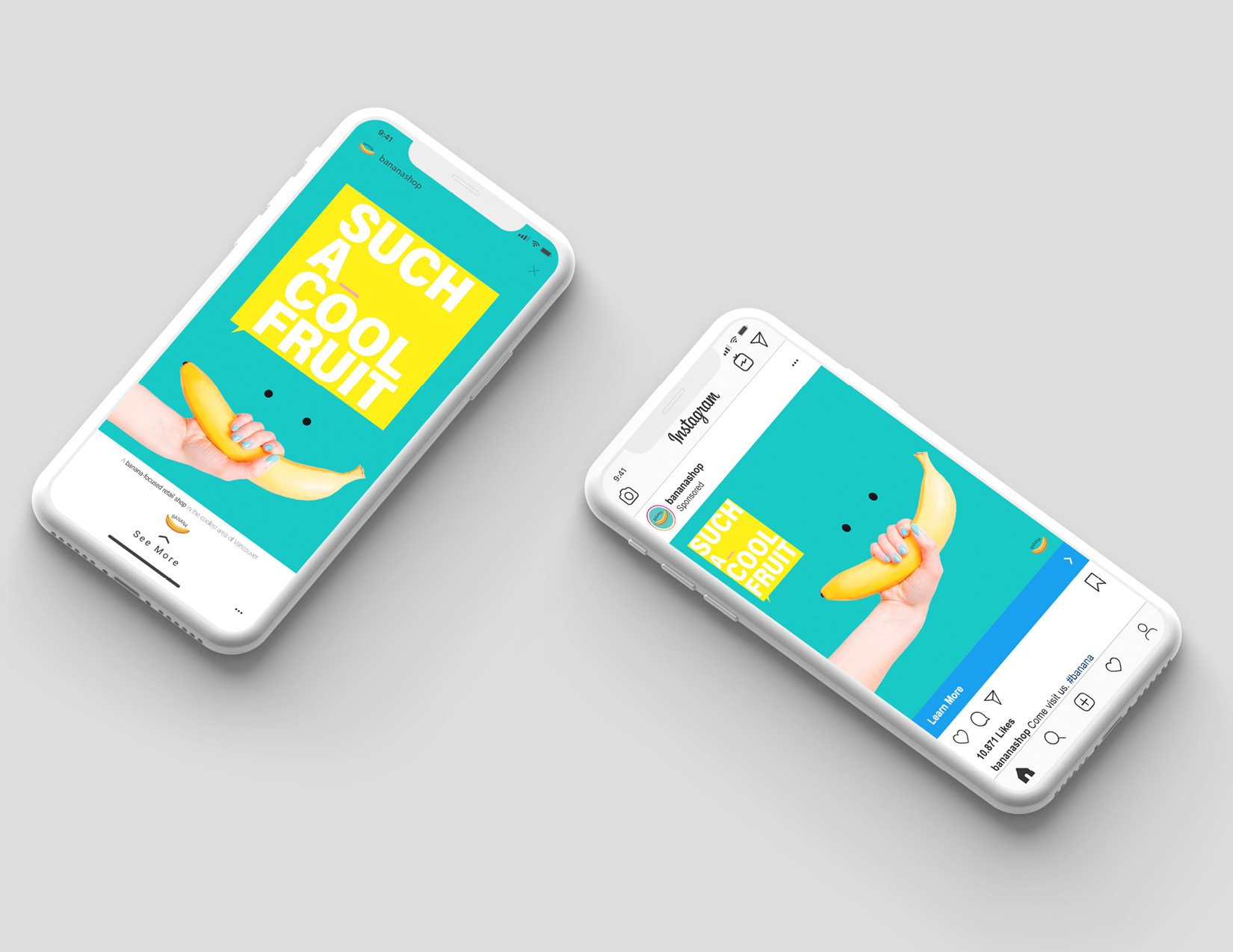
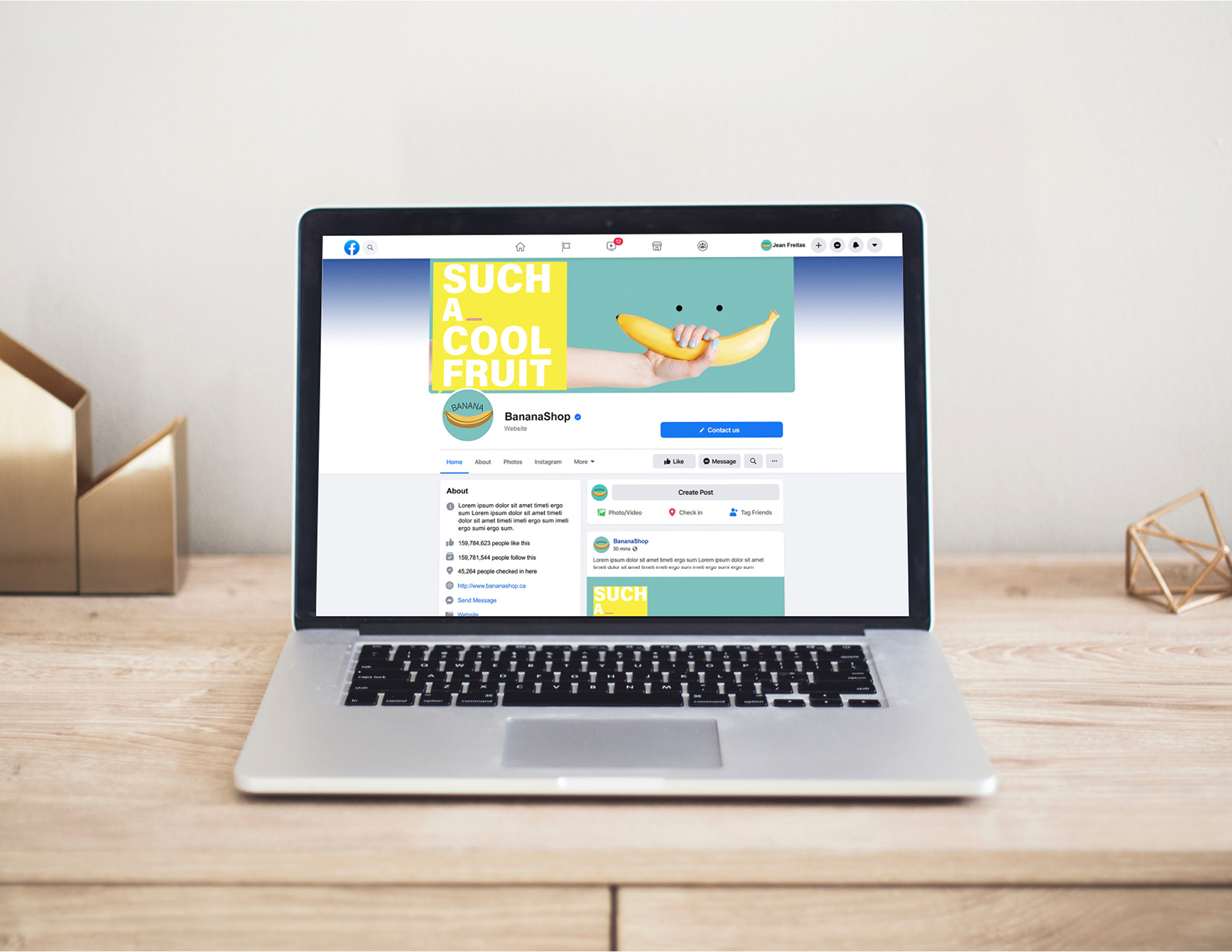
Facebook page
As the project is a re-branding to attract new young customers, vibrant colours were chosen to create a good contrast and stand out the elements of the project.
The logo has an important role in the process of re-branding. The idea was to create a playful logo with few colours to give a "cartoonish" idea and attract the young audience.
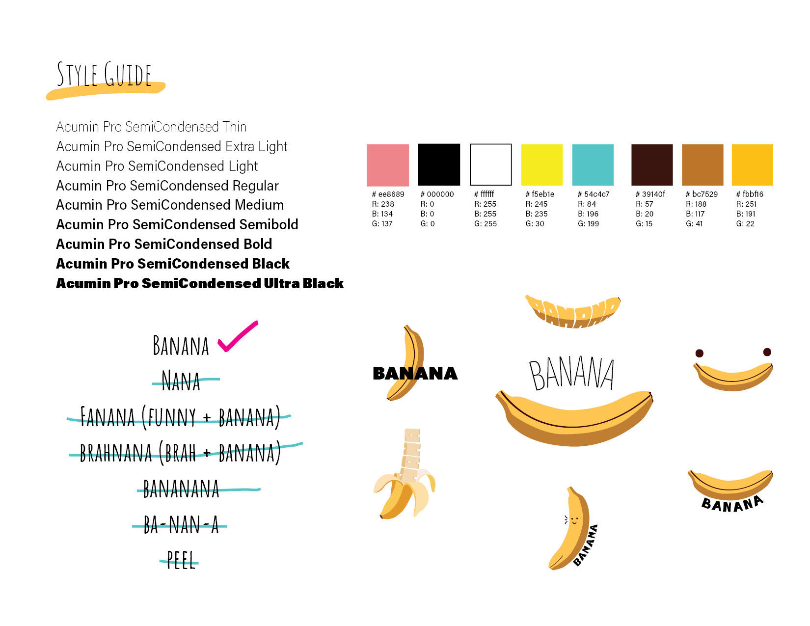
The typeface is a sans-serif one with a big family which could be used the same font but with different weights and sizes. It kept the consistency of the project.
In terms of brand name, the idea was to keep it easy and eye-catching.
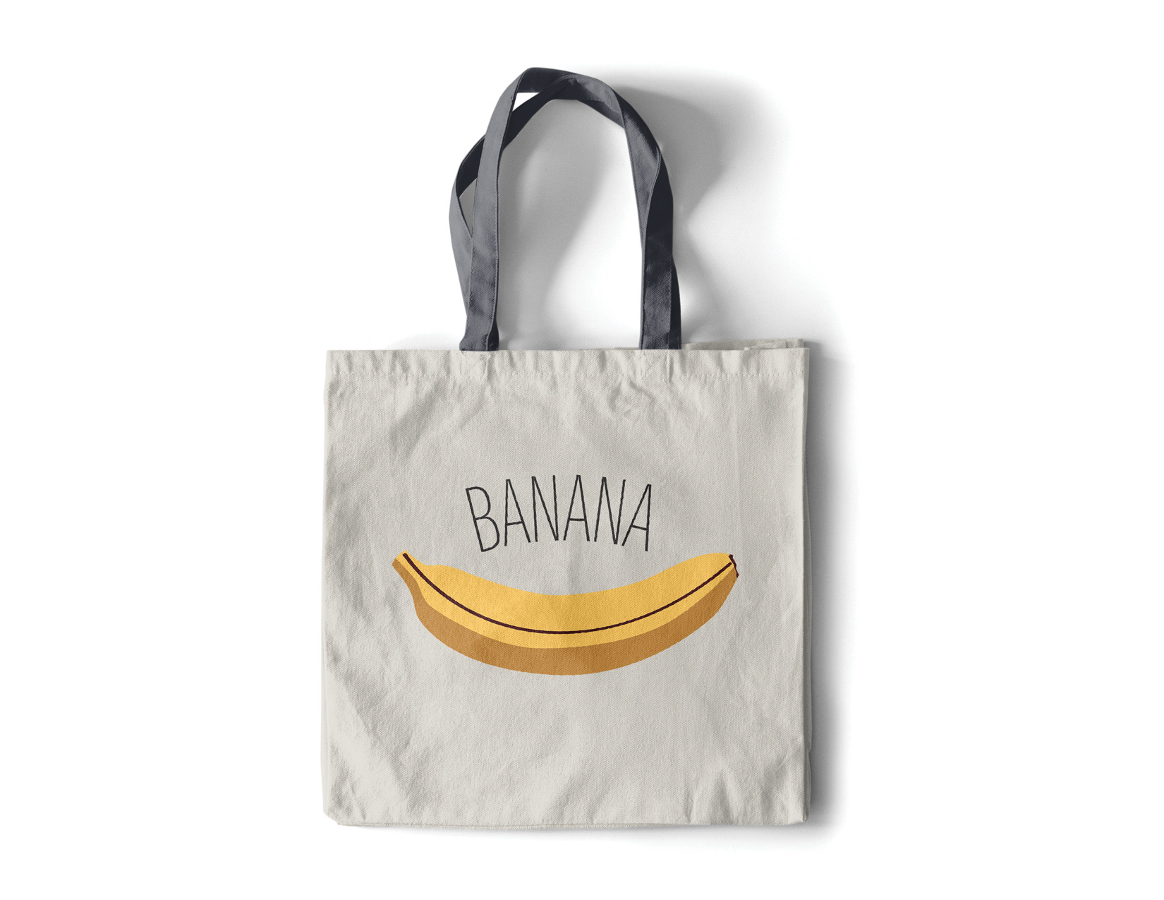
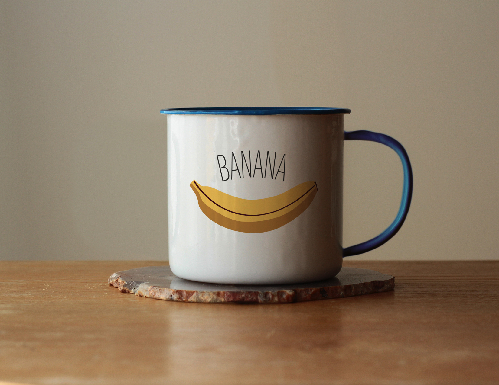
Merch
Project developed on Adobe Photoshop, Adobe InDesign, and Adobe Illustrator.